Vera
Project
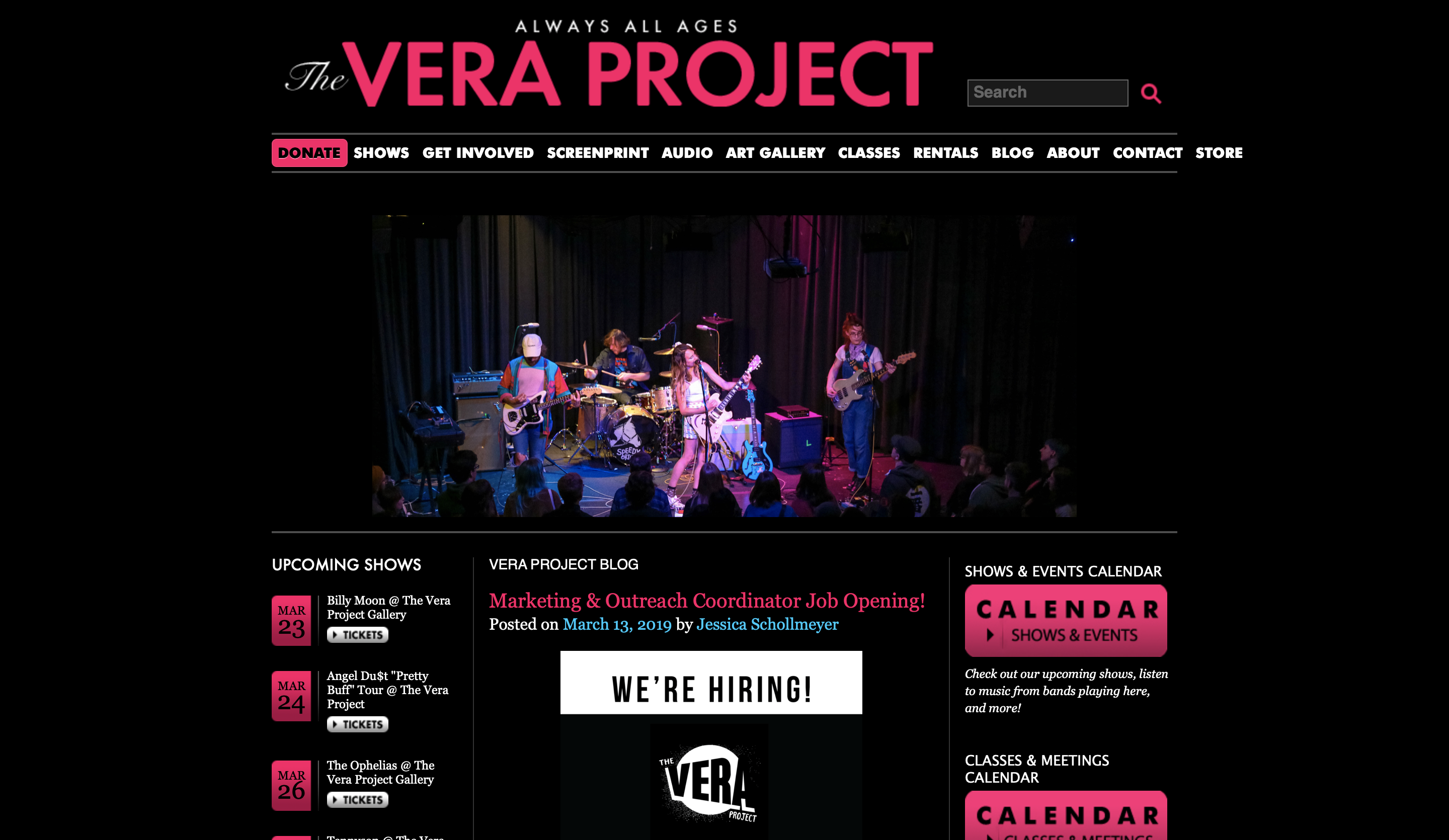
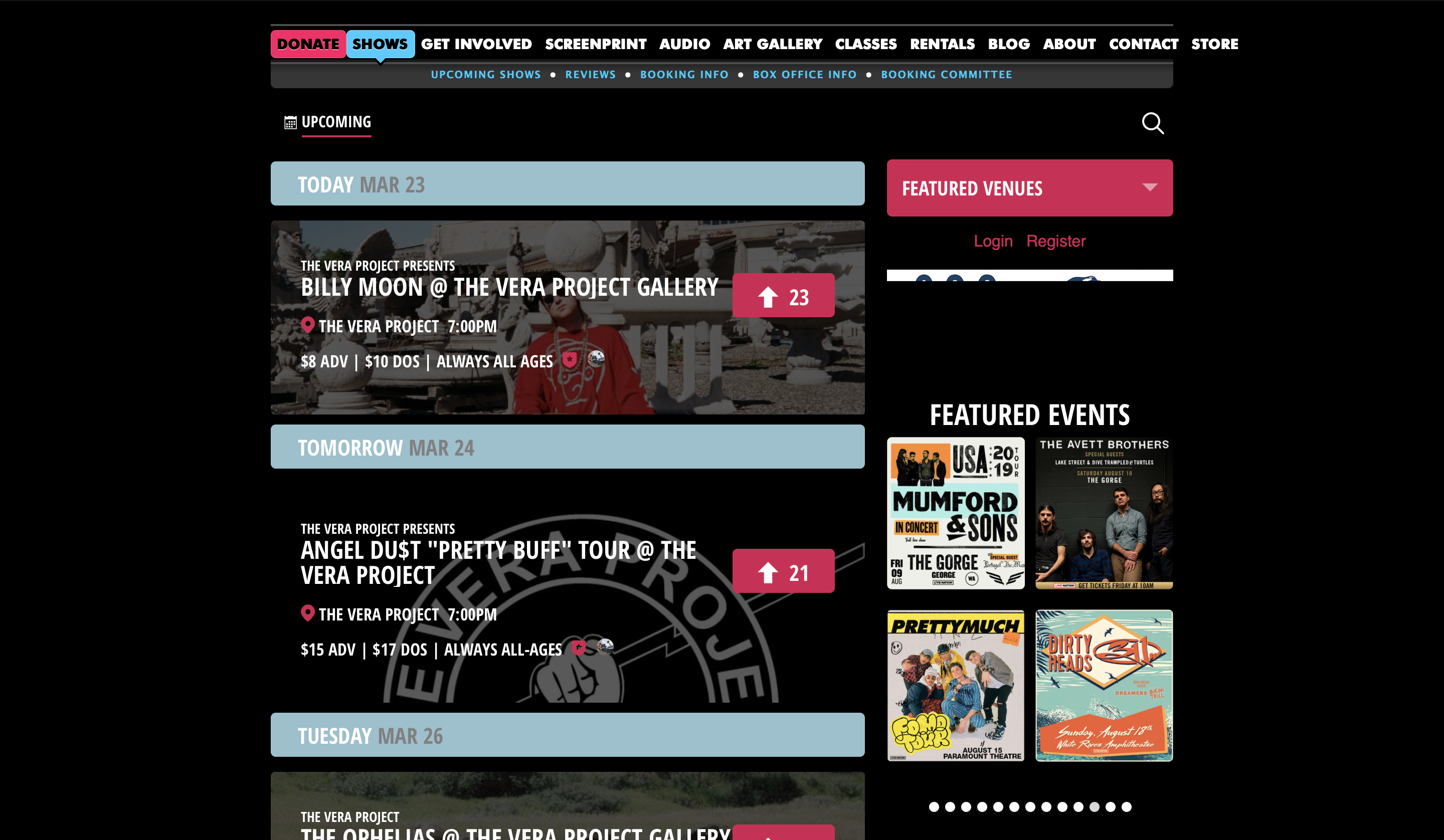
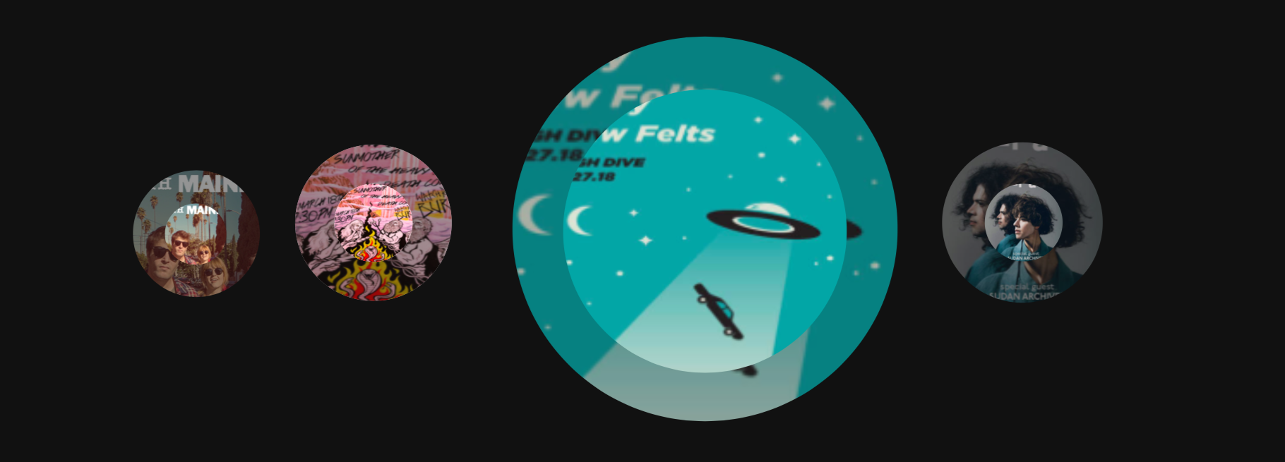
Gallery 1: "Landing Page" & "Shows Page" from the original website * "Shows Page": Information about upcoming shows and tickets are listed on this page
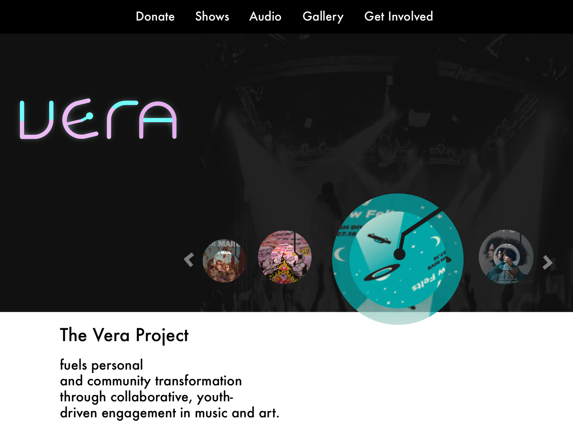
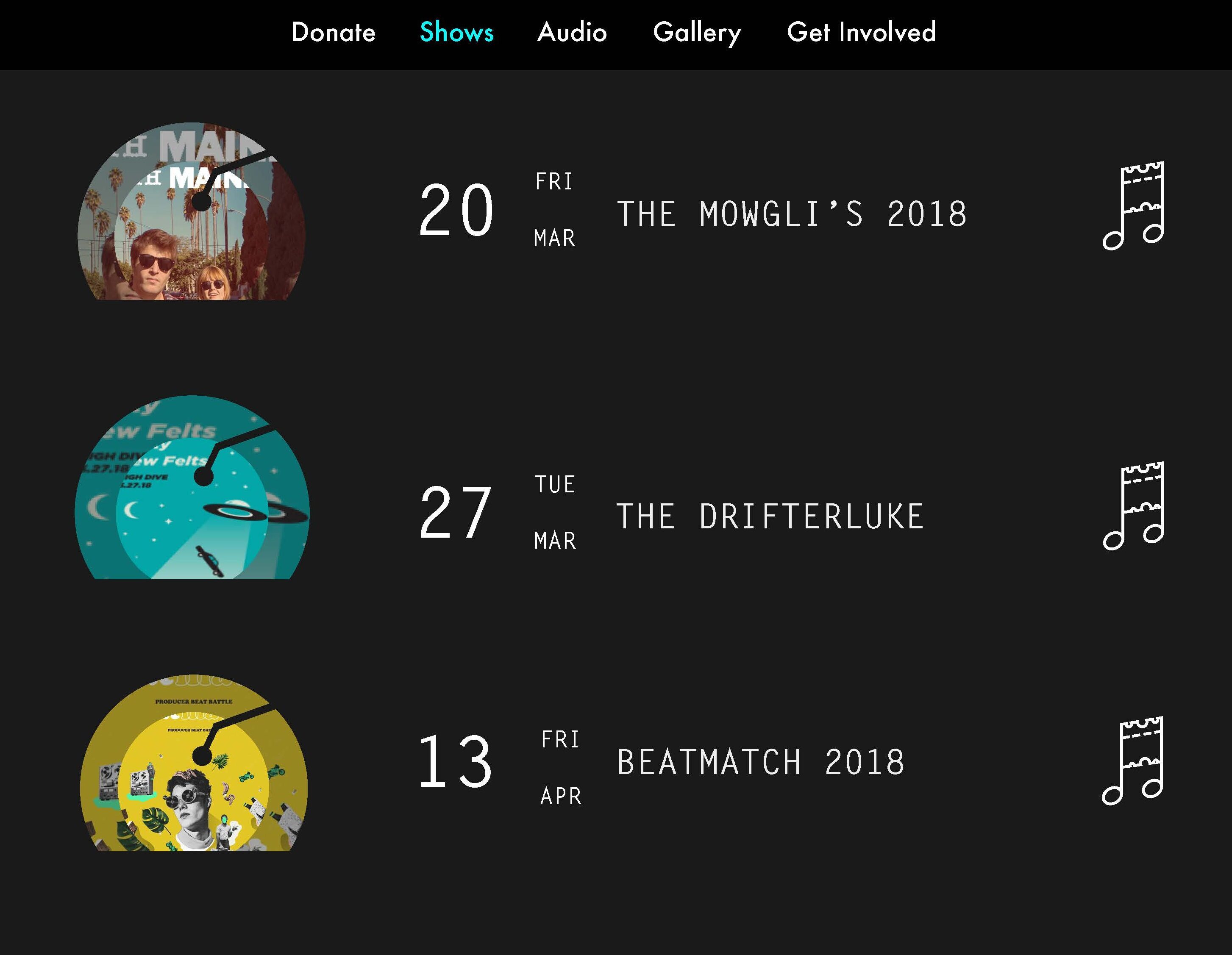
Gallery 2: The redesigned "Landing page " & "Shows Page"
Background
For the final project for HCDE 308, I redesigned the visual system for VERA, an all-ages volunteer-fueled arts venue. VERA aims to foster a participatory creative culture through music concerts, arts programs, experimental earning, and volunteer opportunities.
Type: Course (HCDE 308) Final Project
My role: UX & UI Designer
Time: June 2018 - Jan 2019
Project Scope: UX & UI Design, Website Design
Goal: To design a cohesive visual system including logo, icons, and user interfaces for VERA's official website.
Lego Design
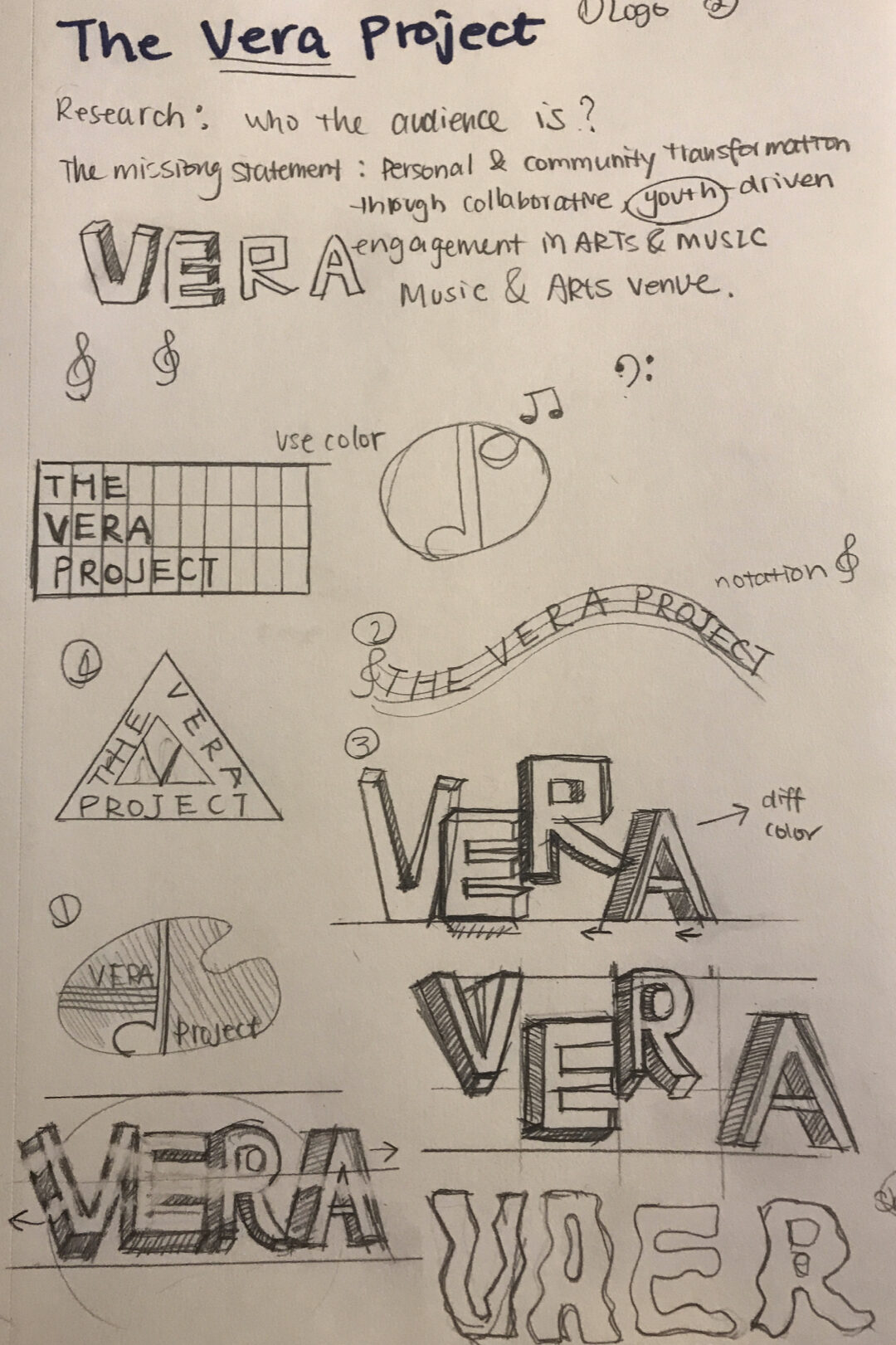
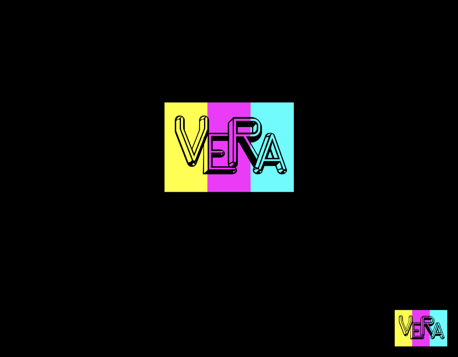
[Fig 1] Brainstorm of the logo design
Who is the targeted audience?
VERA Project aims to create a personal (or community) transformation through collaborative, youth-driven engagement in Arts and Music. So the potential users are:
- Individuals who love arts
- Individuals who enjoy music
- Youth who want to pursue arts as their future career
So when I designed the brand logo for VERA Project, the idea of being "collaborative", "passionate", and "young" were incorporated into the design.
As shown on the left, figure 1 shows some brainstorms for the logo design. Incorporating the three ideas mentioned above, I also considered including elements such as music note  or drawing panel
  to highlight the artistic side of this project.
* During the idea critique section, I had received some "negative" feedbacks toward the idea of highlighting the artistic side, which I found very helpful. So I made certain changes for the first round of ideations.
After received critiques from classmates, I decided to get rid of all the art components because the VERA Project has other focus areas besides music and painting. Simply adding music notes or making the logo looked like a drawing panel is not the best way to interpret the term "Art" and most importantly, it might mislead first-time users.
[Fig 1a] Draft that included the "glowing stick" idea
[Fig 1b] Draft that used the "glowing stick" idea by using illuminated neon colors
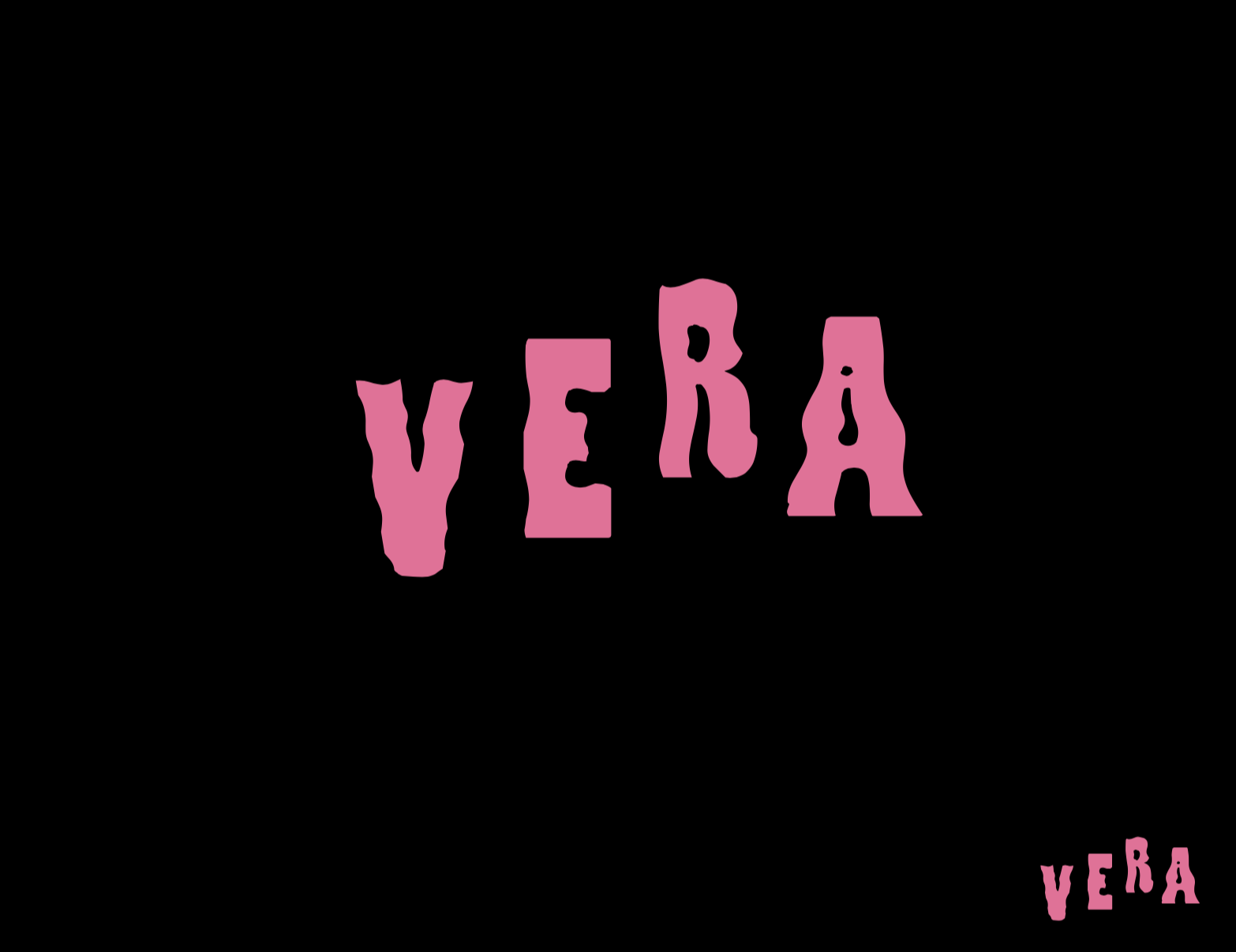
[Fig 1c] Draft that conveyed the idea of "collaborative" and "inclusive"
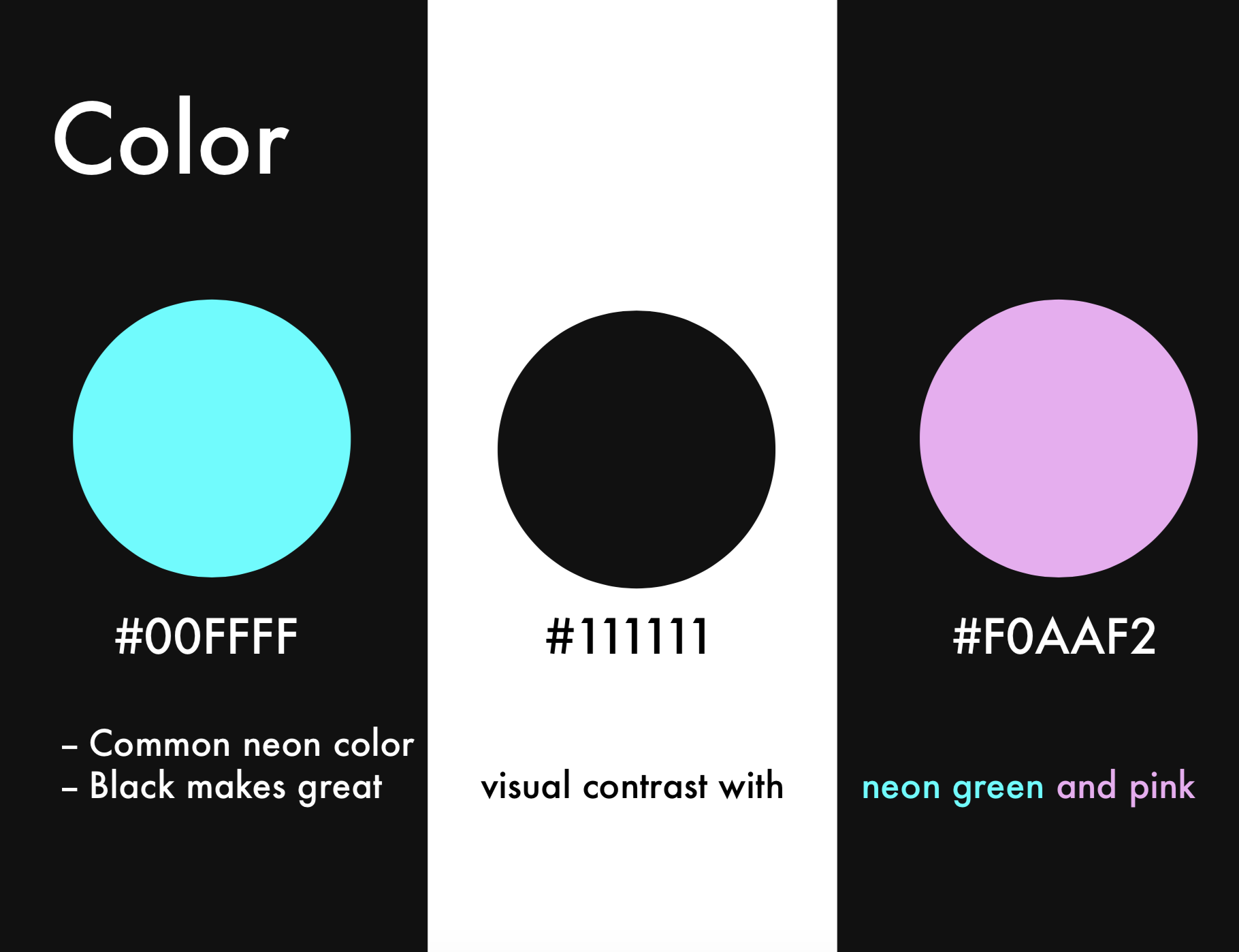
VERA Project provides many art-related events and programs, but the music show is the most important one with many participants. After realizing that the music shows are the representative event for the VERA Project, I gained a new perspective when I went back to view the original website design. The original design has a very strong visual contrast by boldly using black and bright pink. When users view the website, the black background conveys a sense of being in a dark live house and the use of bright pink can quickly catch users' sight. Getting inspiration from the original design, I came out with the "glowing stick" idea. As shown in Figure 1a and Figure 1b, both drafts incorporated the shape and the colors of the glowing stick.
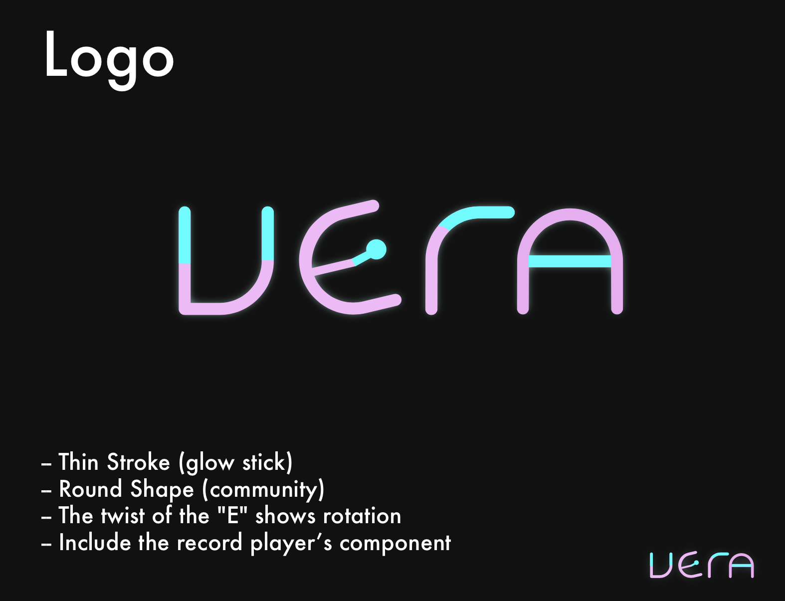
[Fig 2] the final draft of the logo design
Figure 2 is the final version of the logo design. This logo works well with VERA's key ideas:
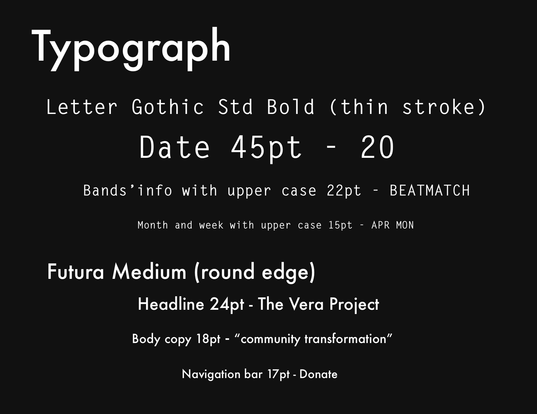
- The shape of the font "Letter Gothic Std Bold" is similar to the shape of a glowing stick
the round stroke conveys a sense of inclusiveness - The common neon green and pink make great visual contrast with the black background
- The twist of the letter "E" shows the movement of a rotated record player (phonograph).
Icon Design
Listing activities posted on the VERA website and then I developed icons that reflect these activities. Figure 3 on the right shows some brainstorms for the icon design.
- VERA has music concerts and lives, so it needs an icon indicating the place to purchase tickets
- VERA has shows and events, so it needs a calendar to show detailed information
- VERA has its own art gallery, so it needs an icon to direct users to get access to the gallery
- VERA provides music classes such as keyboarding, audio mixing and etc, so it needs the icon to direct users to the right panels
*During the idea critique section, I have received multiple positive and negative feedbacks toward the design language.
[Fig 3] Brainstorm of the icon design
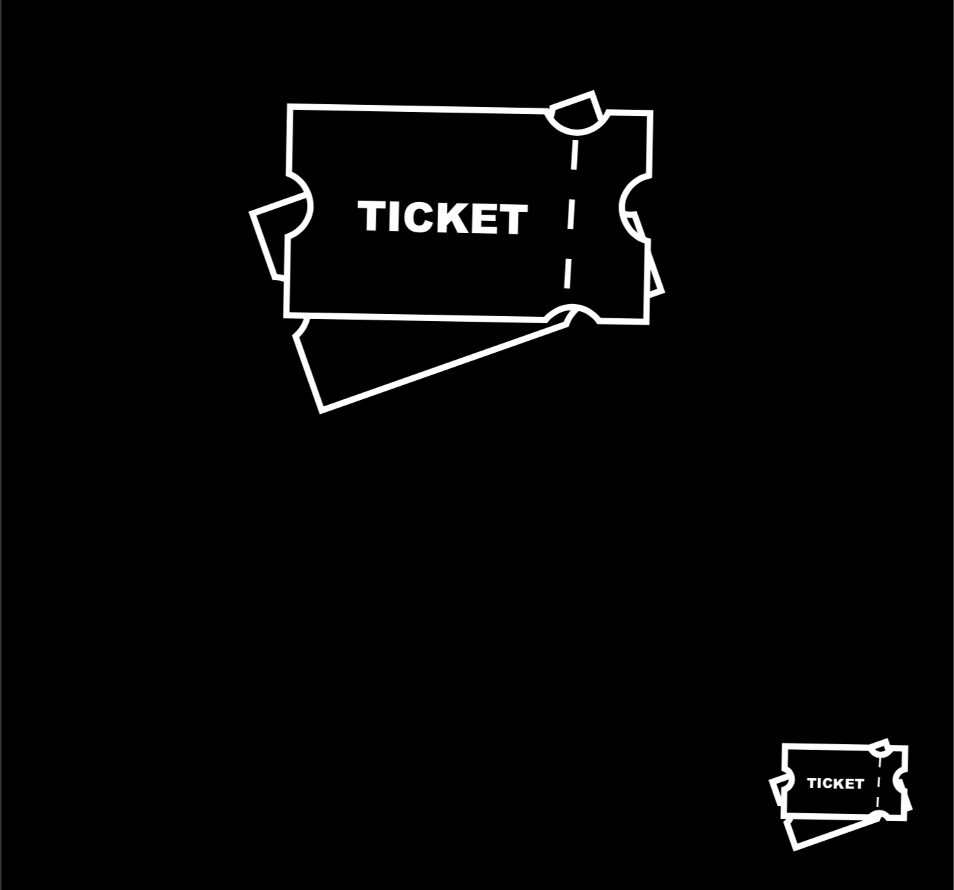
Figure 3a: Icon for ticket
"You need a cohesive design language for all the icons."
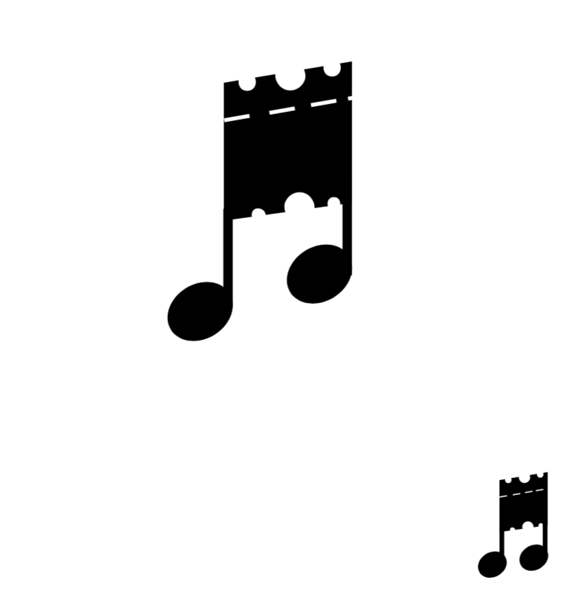
Figure 3b: Icon for ticket
"I like how you made the ticket looks like a music note."
"This icon don't look good when scaling 20% down. The smaller icon on the right-bottom corners have a weird ratio."
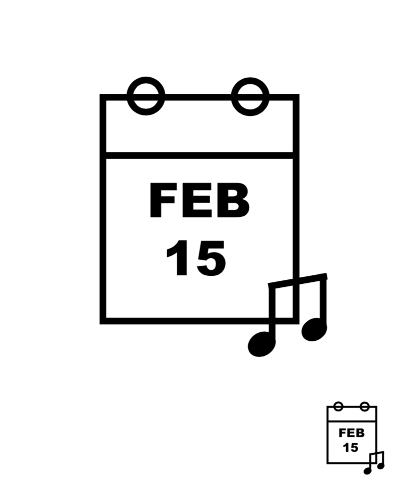
Figure 3c: Icon for calendar
"The mixer and keyboard icons (see Figure 3e & 3f) need some simplifications because they were considered too complex."
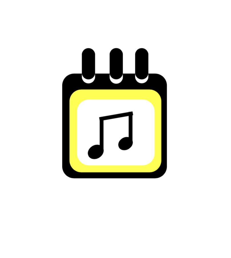
Figure 3d: Icon for calendar
"Pay attention to the little details because there are few spots where the lines don't fully connect"
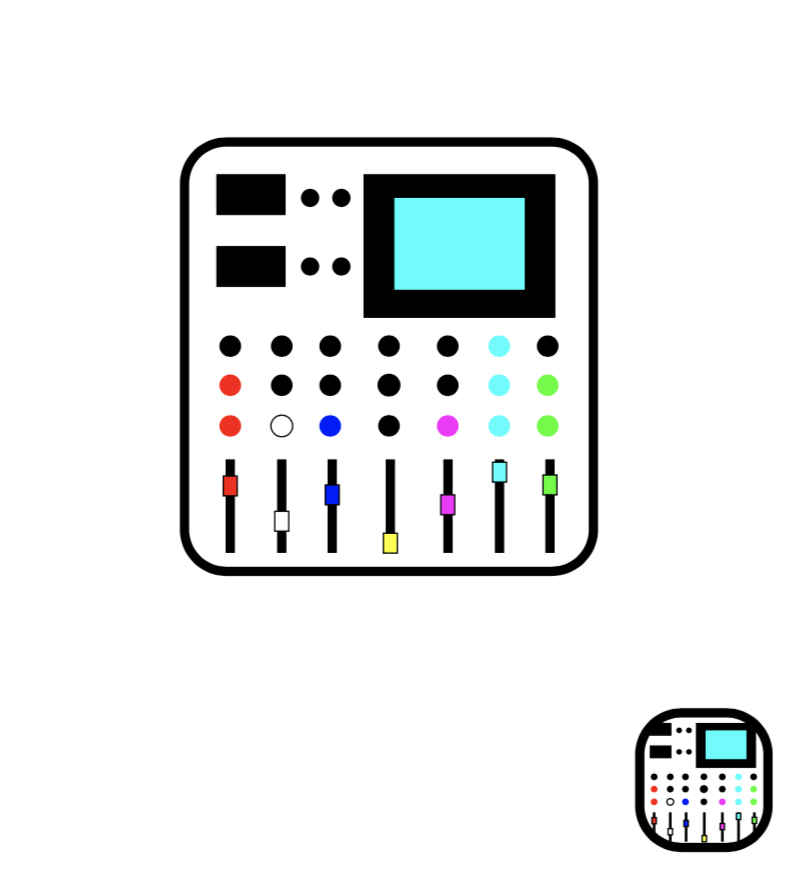
Figure 3e: Icon for audio mixing class
"Maybe consider get rid of the color and make all icons black and white."
"This icon don't look good when scaling 20% down. The smaller icon on the right-bottom corners have a weird ratio."
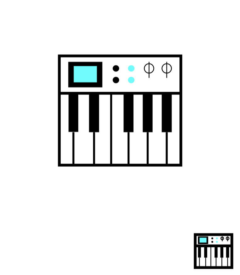
Figure 3f: Icon for keyboard class
"The mixer and keyboard icons need some simplifications because they were way too complex."
For the final round, I need to pick two important events or programs and then develop a pair of icons that reflect them. Finally, I decided to design a pair of icons for ticket purchasing and the audio mixing program. Figure 4 shows the final draft for the icon design. These icons communicate each idea succinctly.
The improvements were made based on the consideration of color, line weight, corners, transitions, shape and etc:
- Got rid of the color and went with white, light line weight
- Simplified the mixer
- Had a cohesive design language by using both thin, white stroke
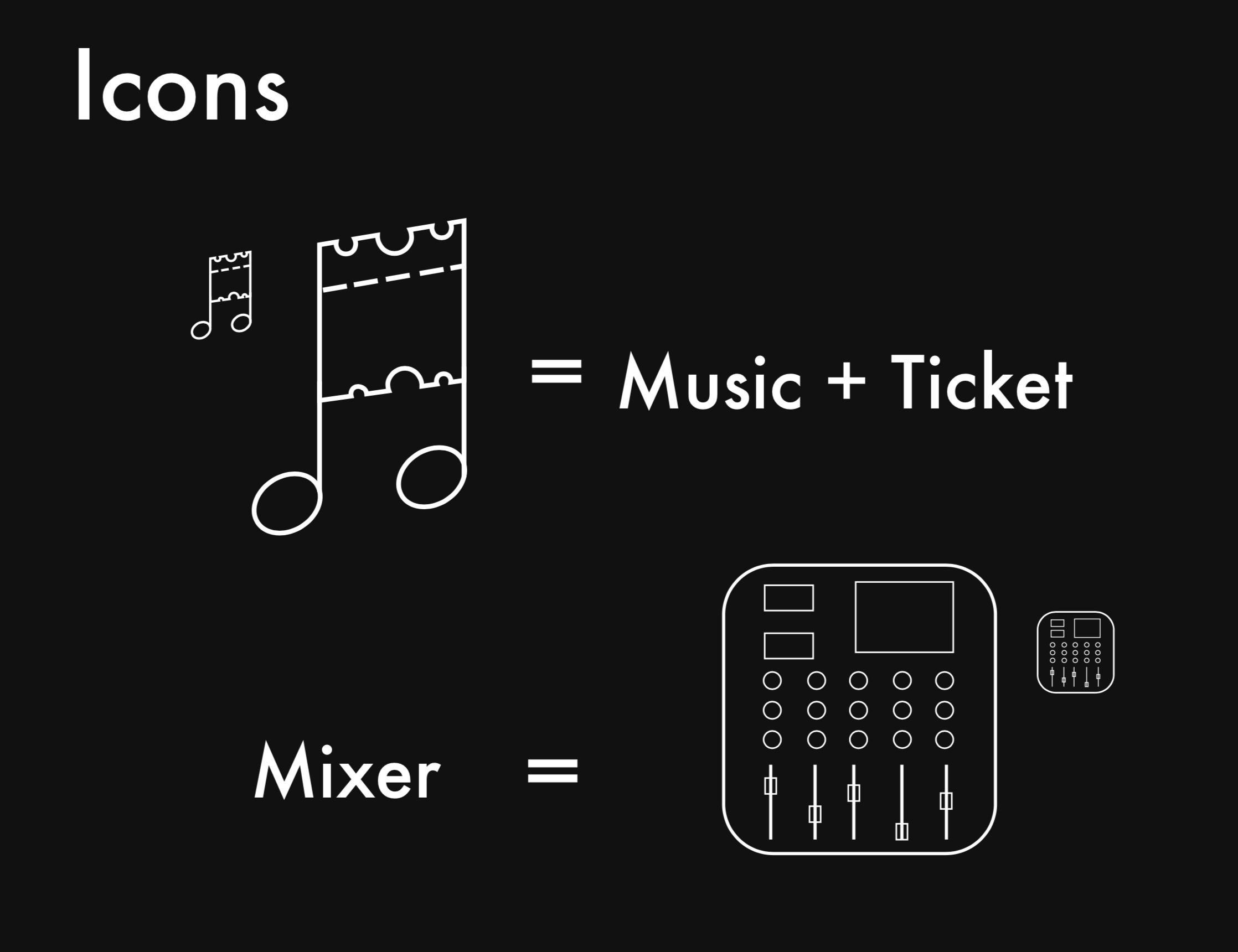
Figure 4: The final draft of icon design
Design Choice